World Community Grid
Refreshing one of the world's largest volunteer computing networks.
Role_
Project & Design Lead
Dates_
2020
Collaborators_
Marie Louka
Edwy Woo
Hugh Knapp
Juan Hindo
Background
This award-winning initiative has been operating since 2004, enabling anyone with a computer and internet connection to support humanitarian research. Contributors donate spare computing power from their devices, which WCG connects into a virtual supercomputer made available to scientists worldwide — finding proteins that fight cancer, climate modelling rainfall in Africa, and more.\n\nIn its long tenure, WCG built a passionate and engaged community, winning a Webby Award in 2016 for Corporate Social Responsibility. After nearly twenty years, the time had come for a redesign — bringing WCG into the IBM design language and reaching new audiences.
800k
users
6.7m
connected devices
2.2m
years of computing time
Creating a new mark
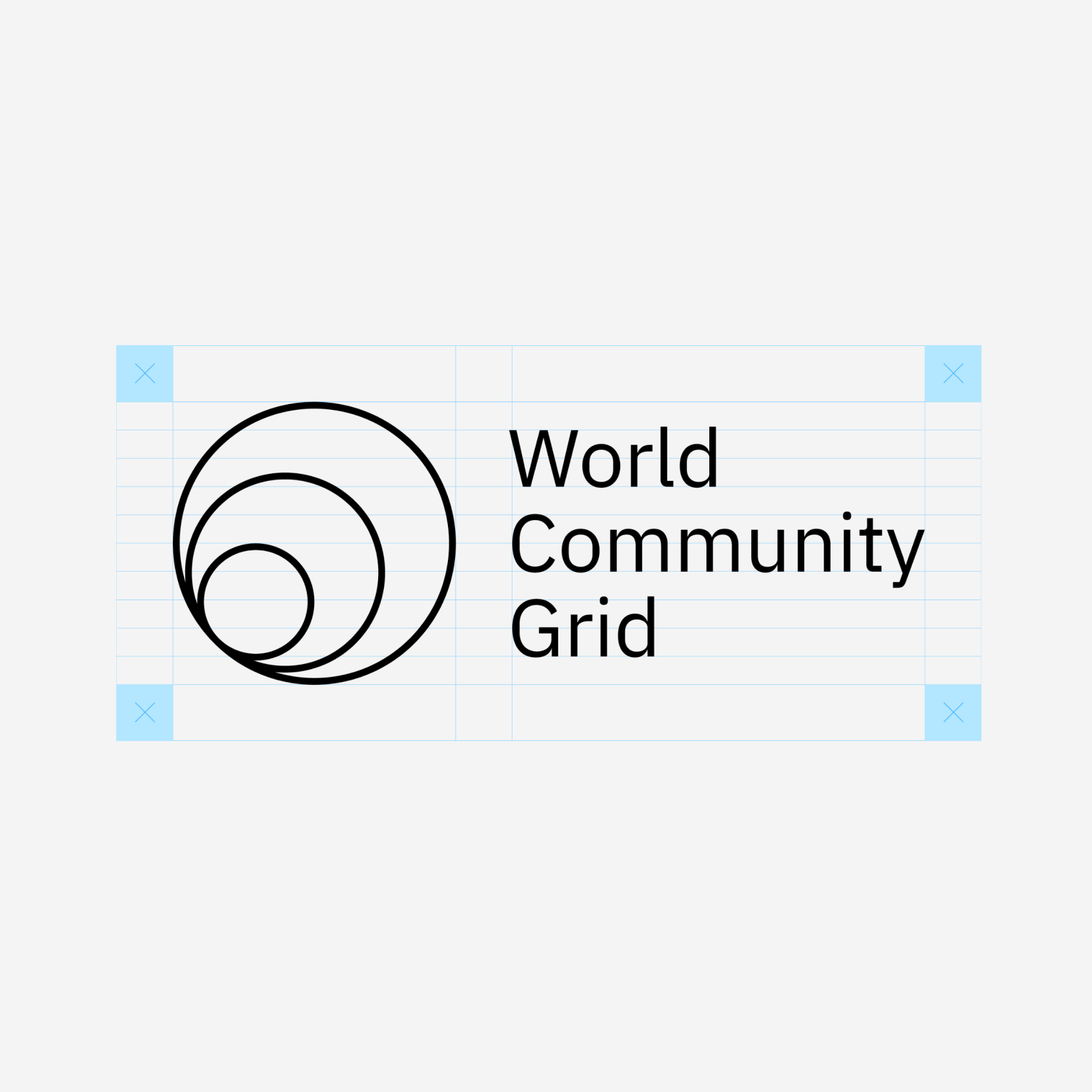
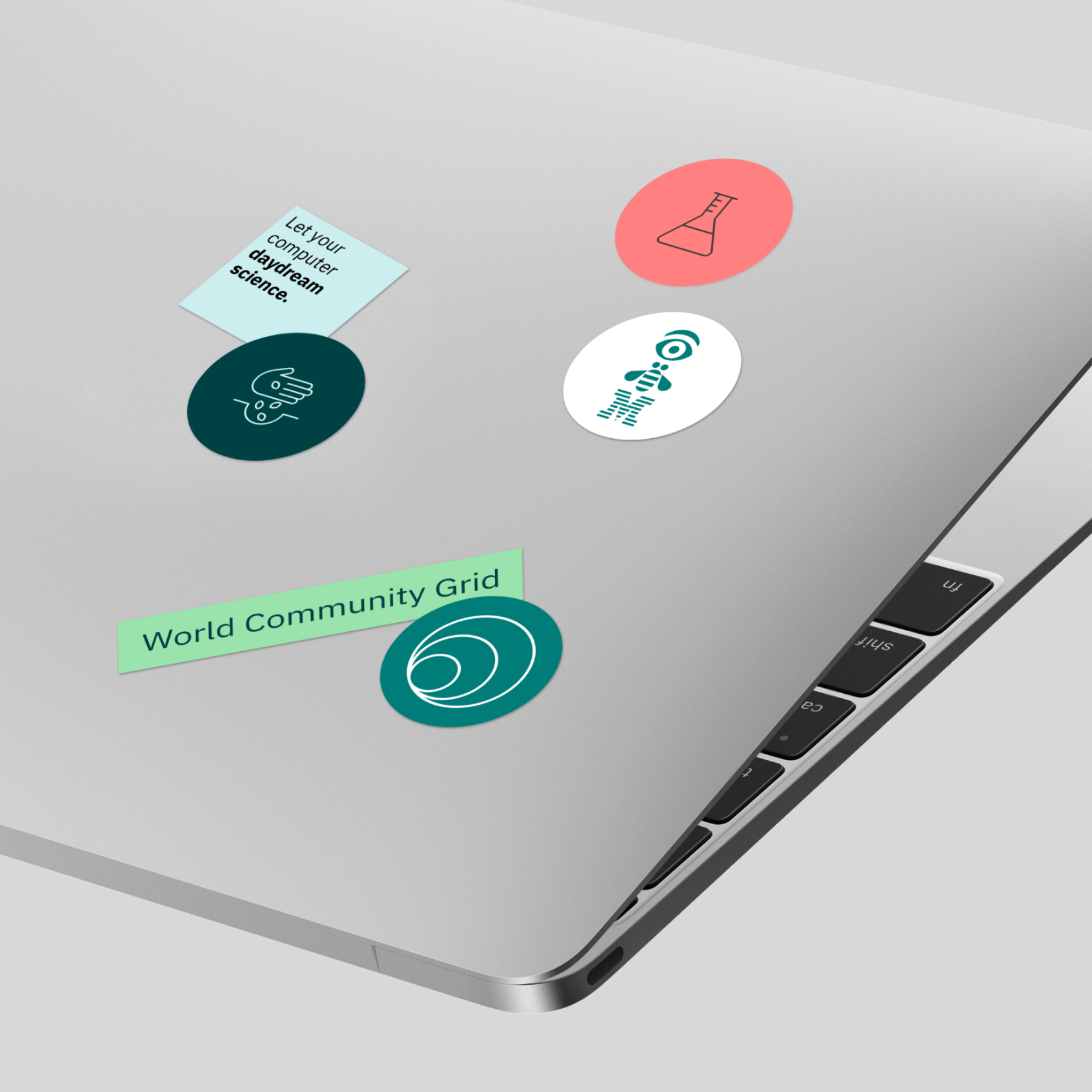
The concept of the logo is based on ideas of amplification, scale, and the collective effort of the global community. The cascading rings are a reference to a ripple effect, angled upwards to denote continual progress in research.
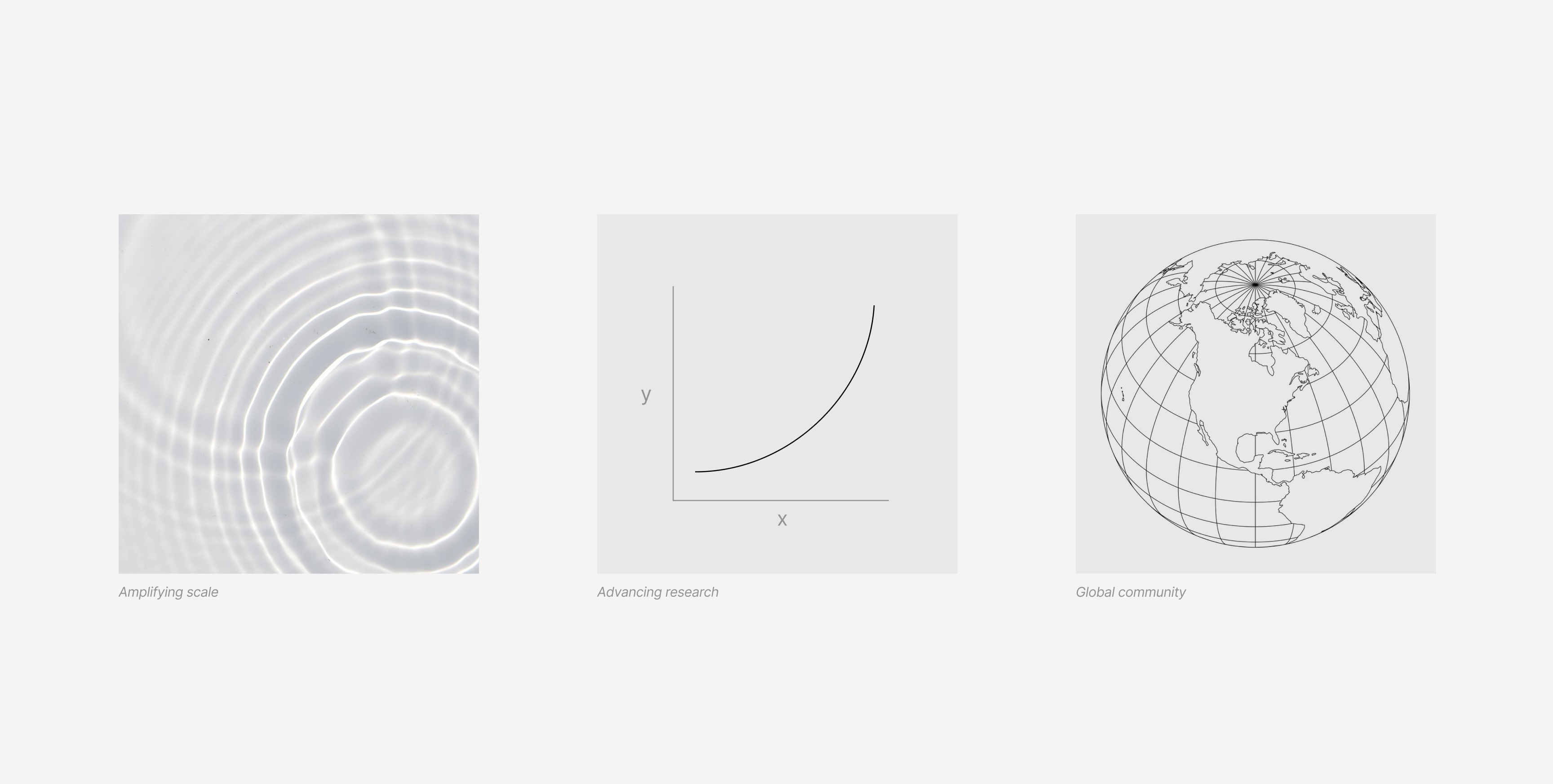


Communicating at different scales
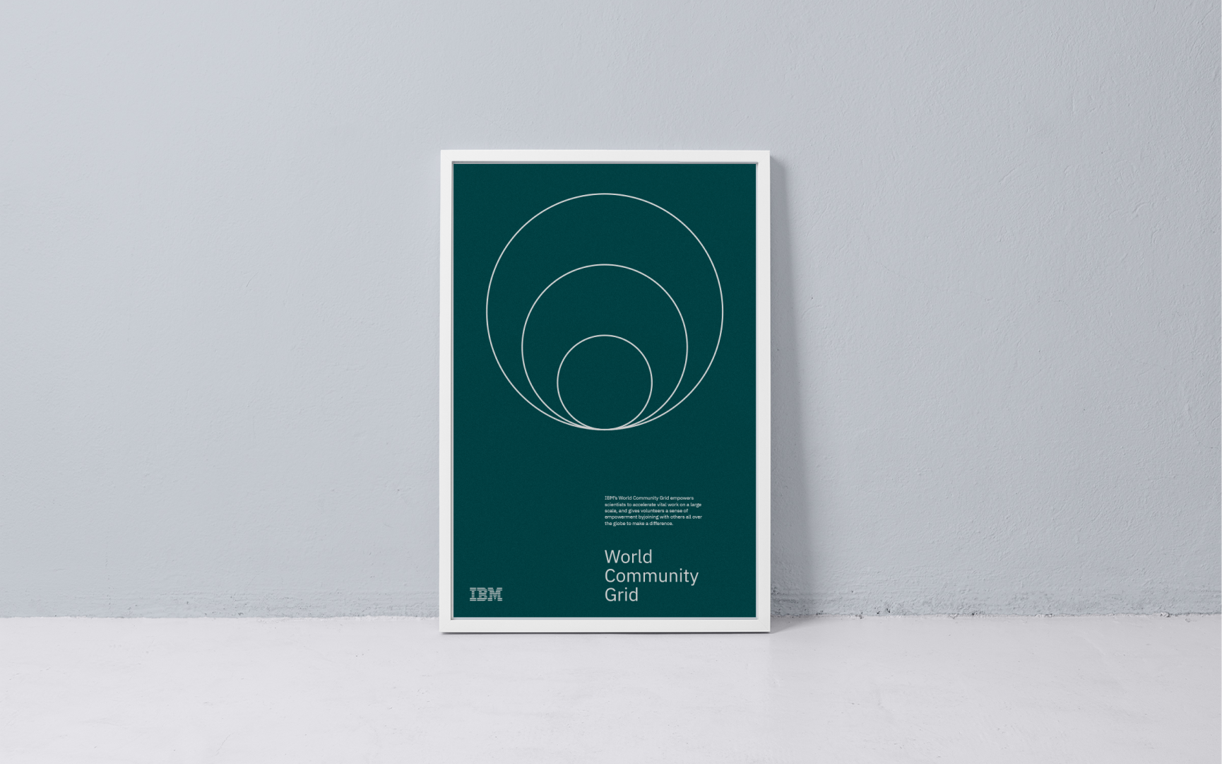
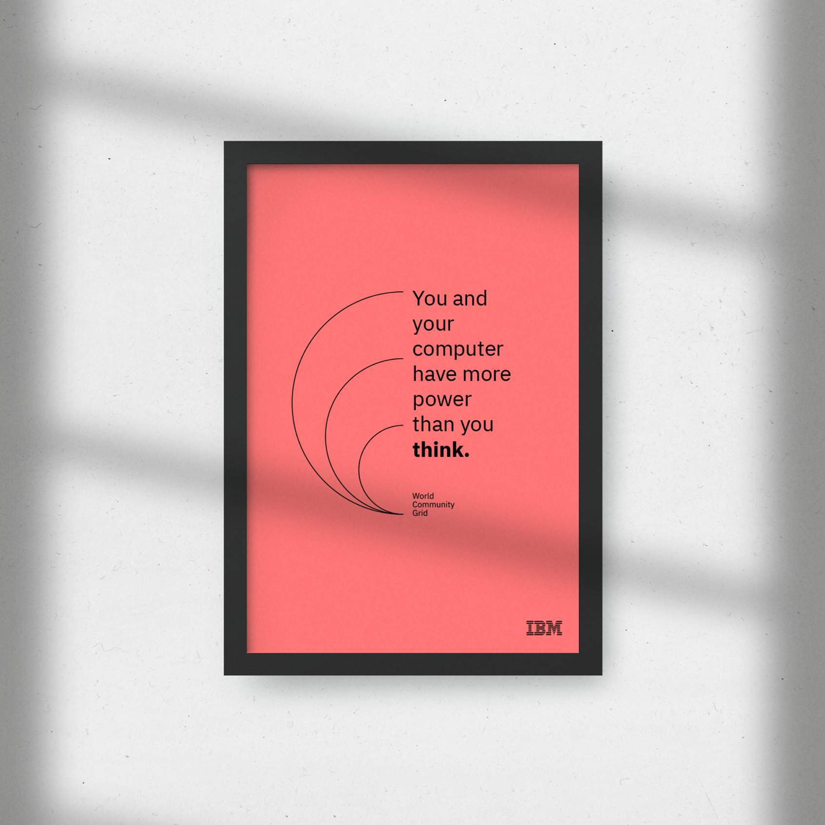
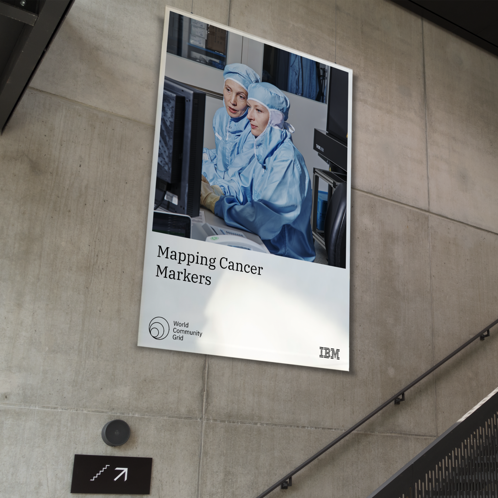
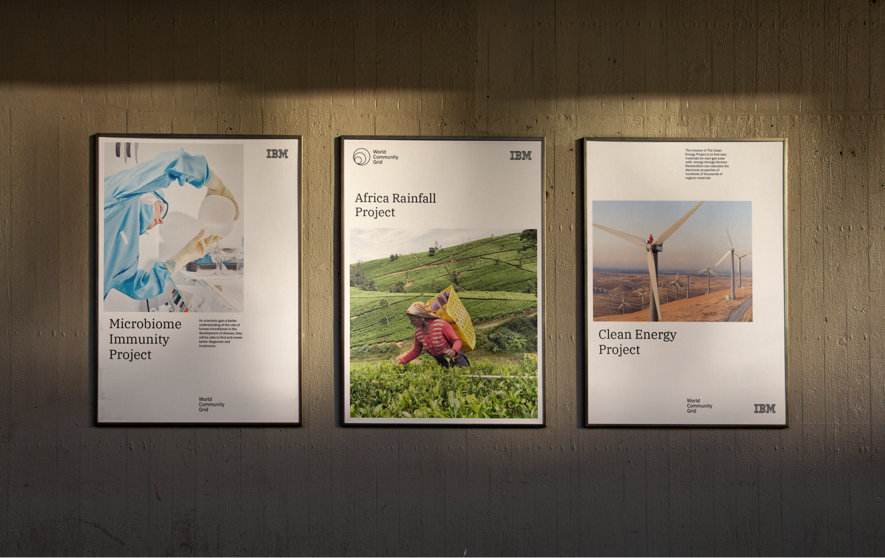
The visual expression aims to communicate both the tangible and abstract aspects of the initiative. When communicating the impact of research at an emotive and human level, the strategy was to utilize photography of the researchers and people being affected by the research.
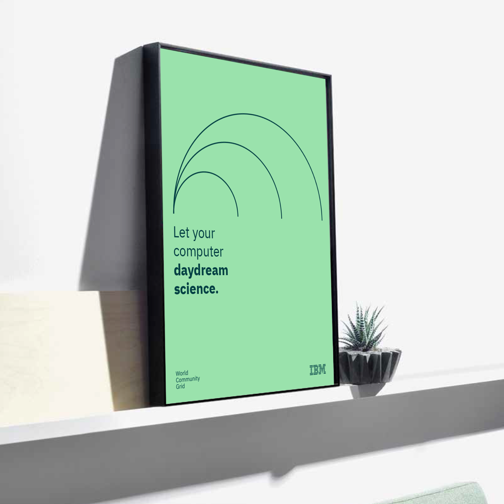
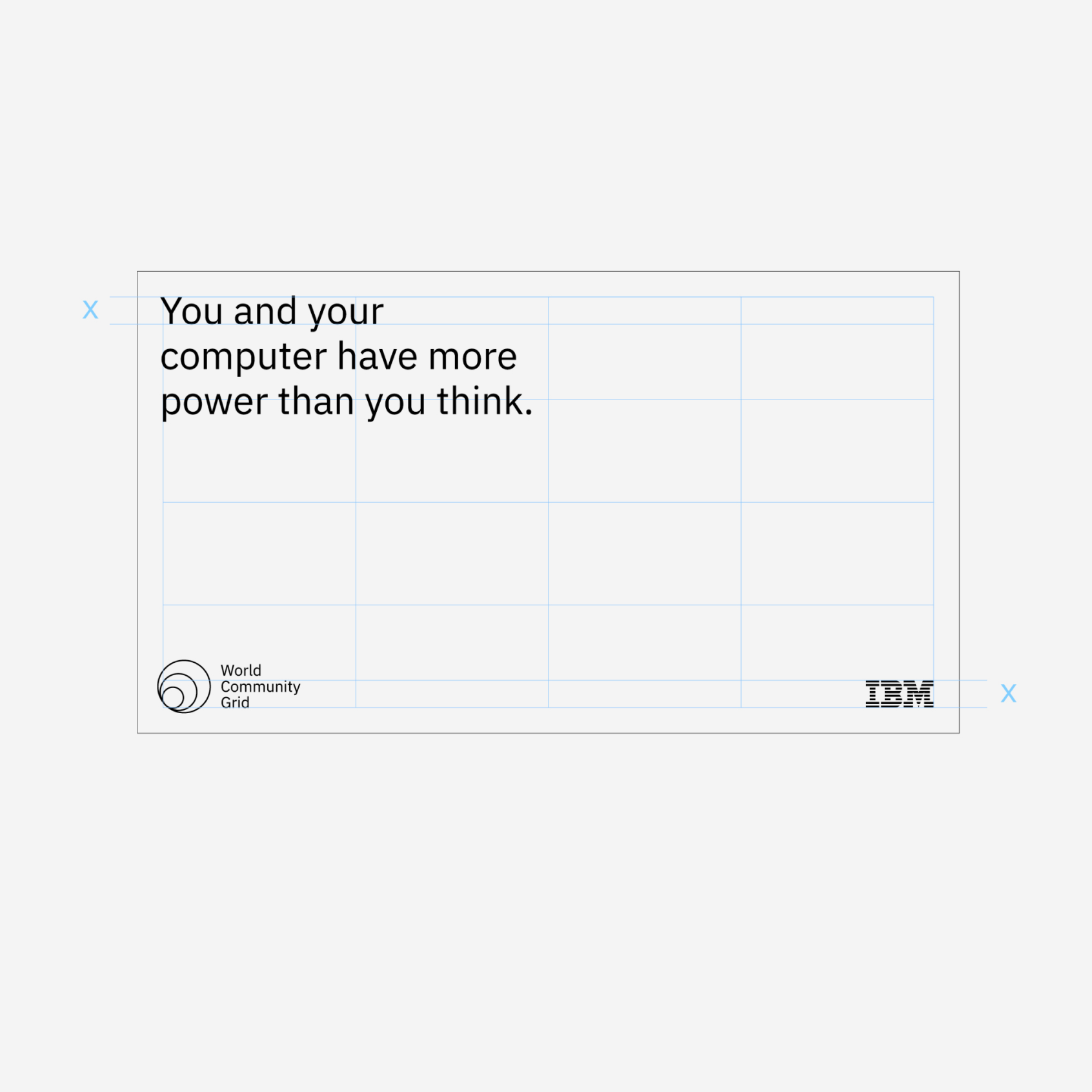
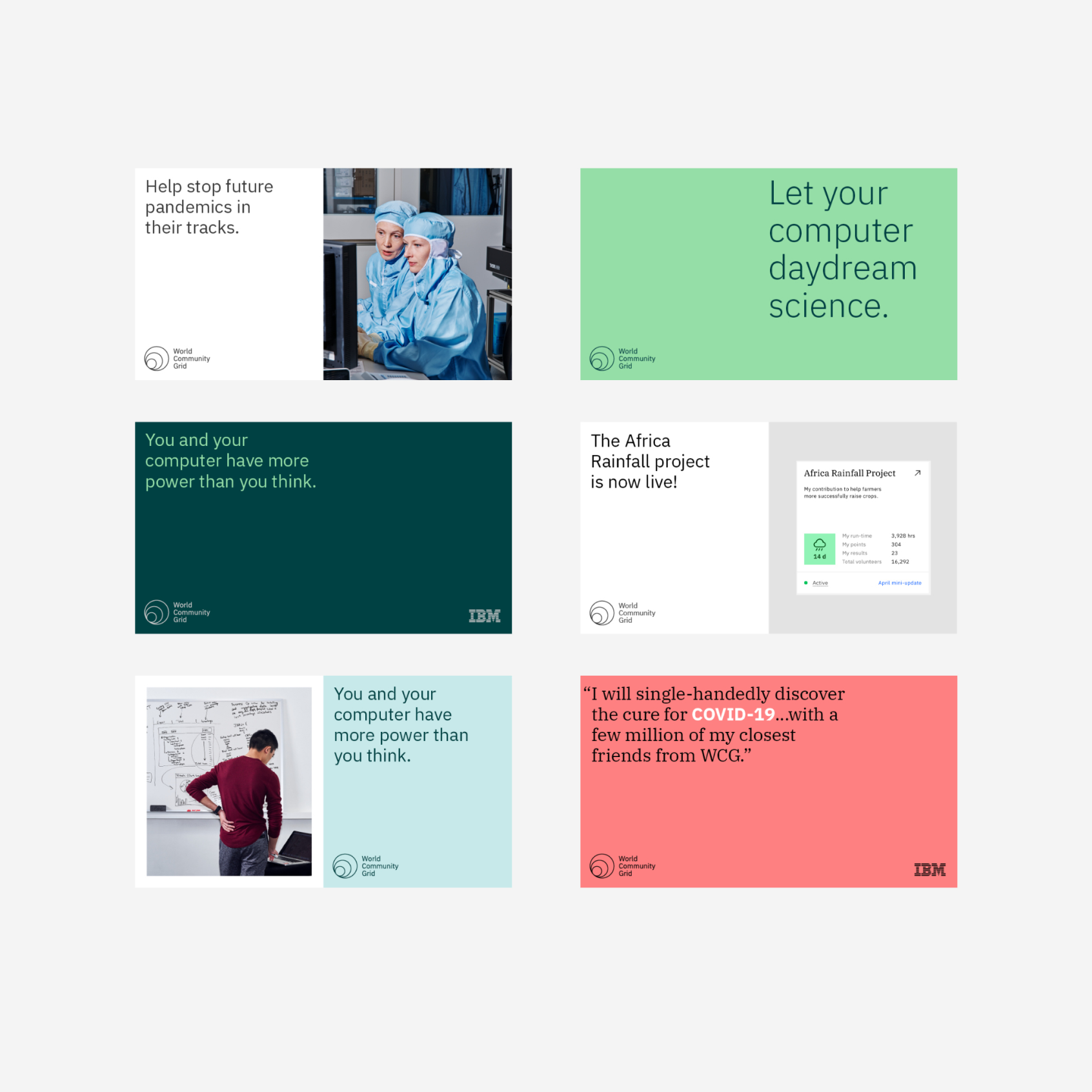
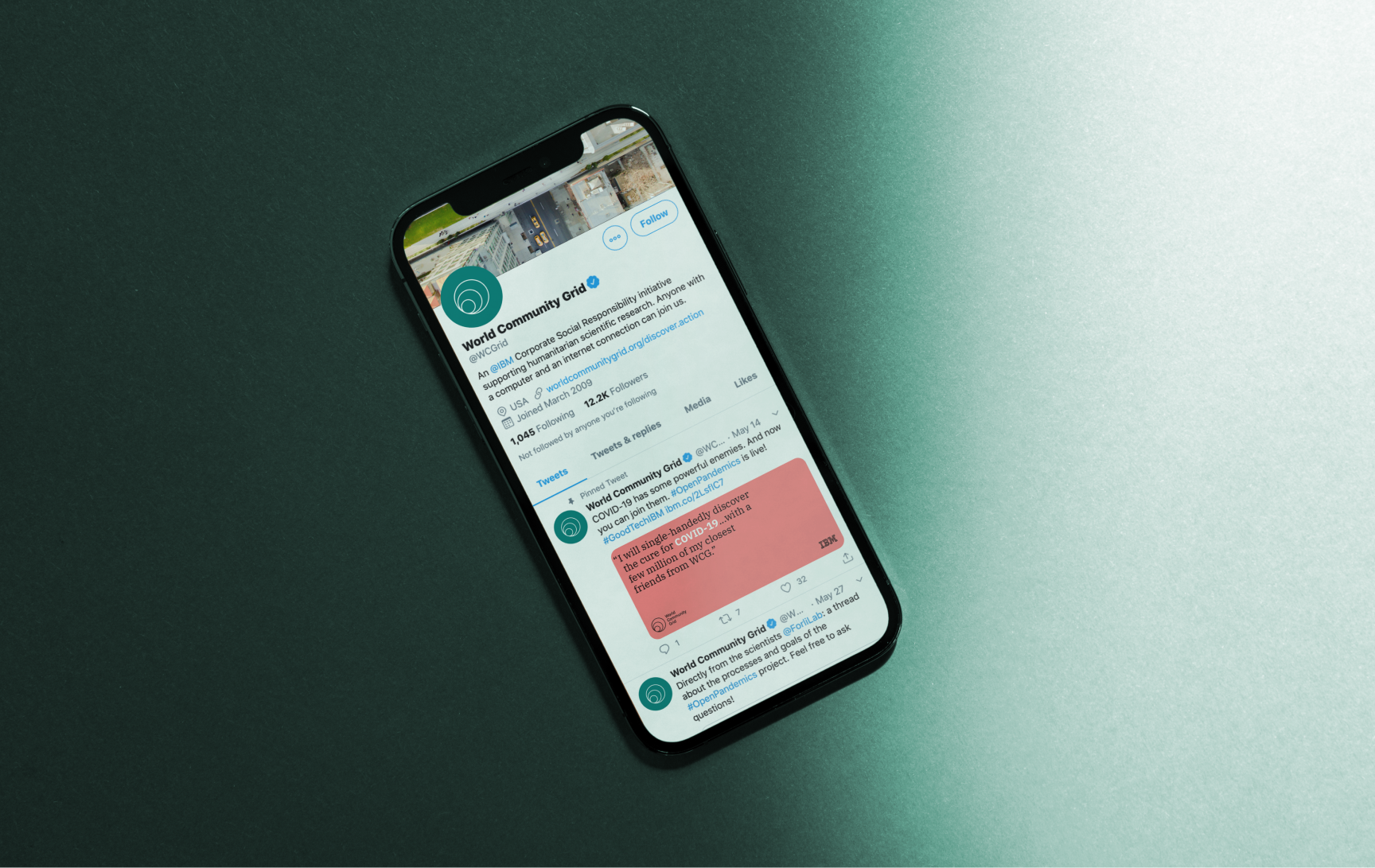
Applications
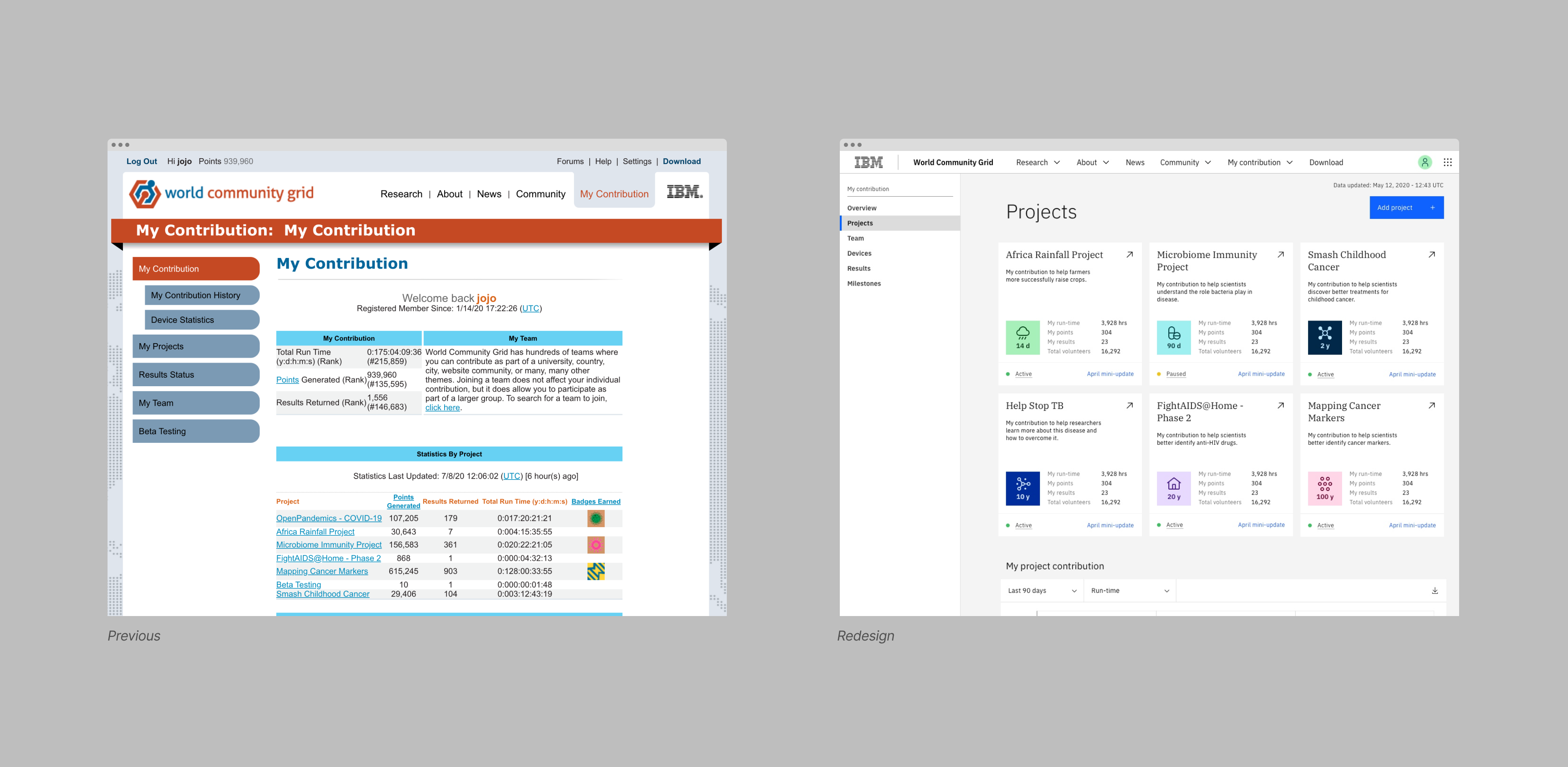
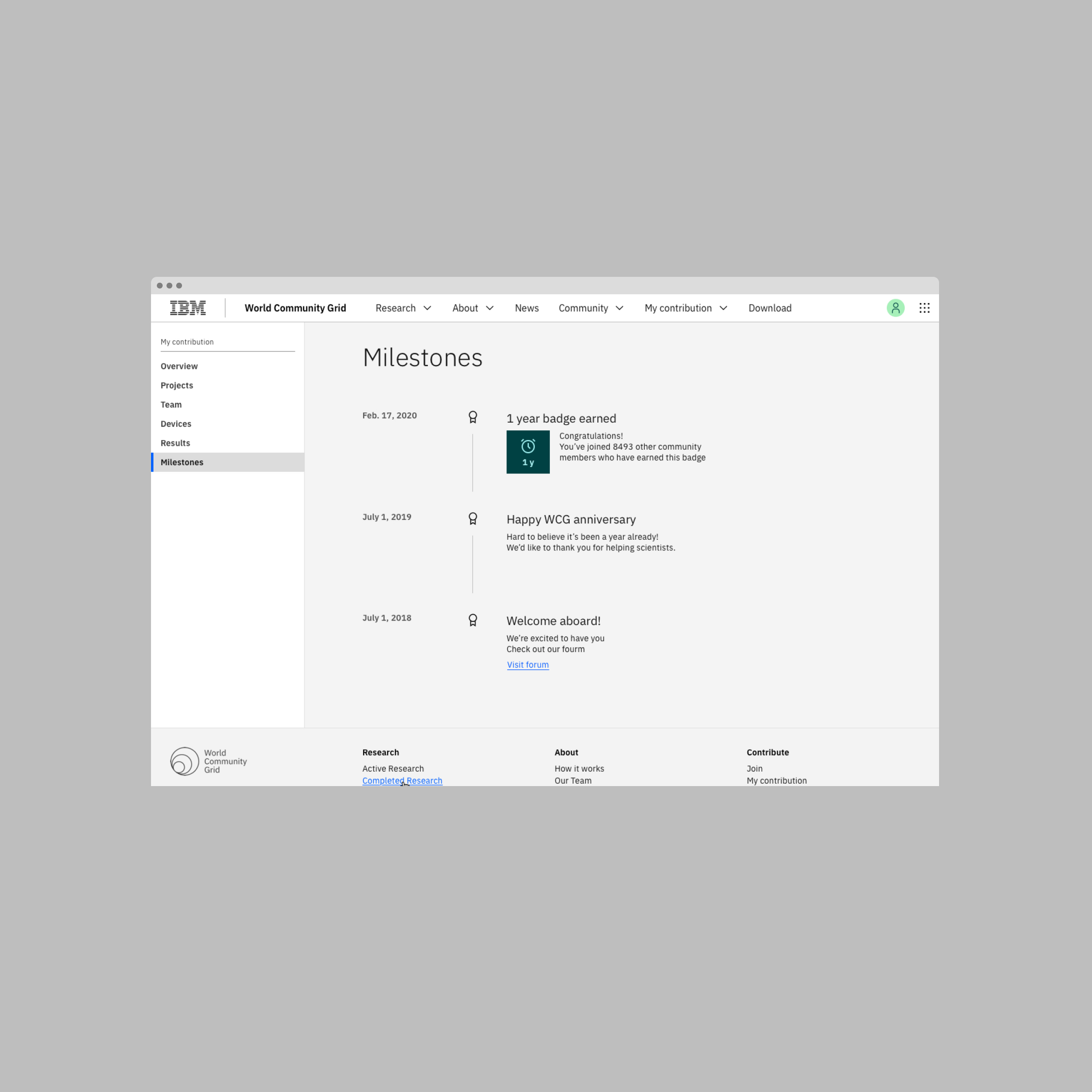
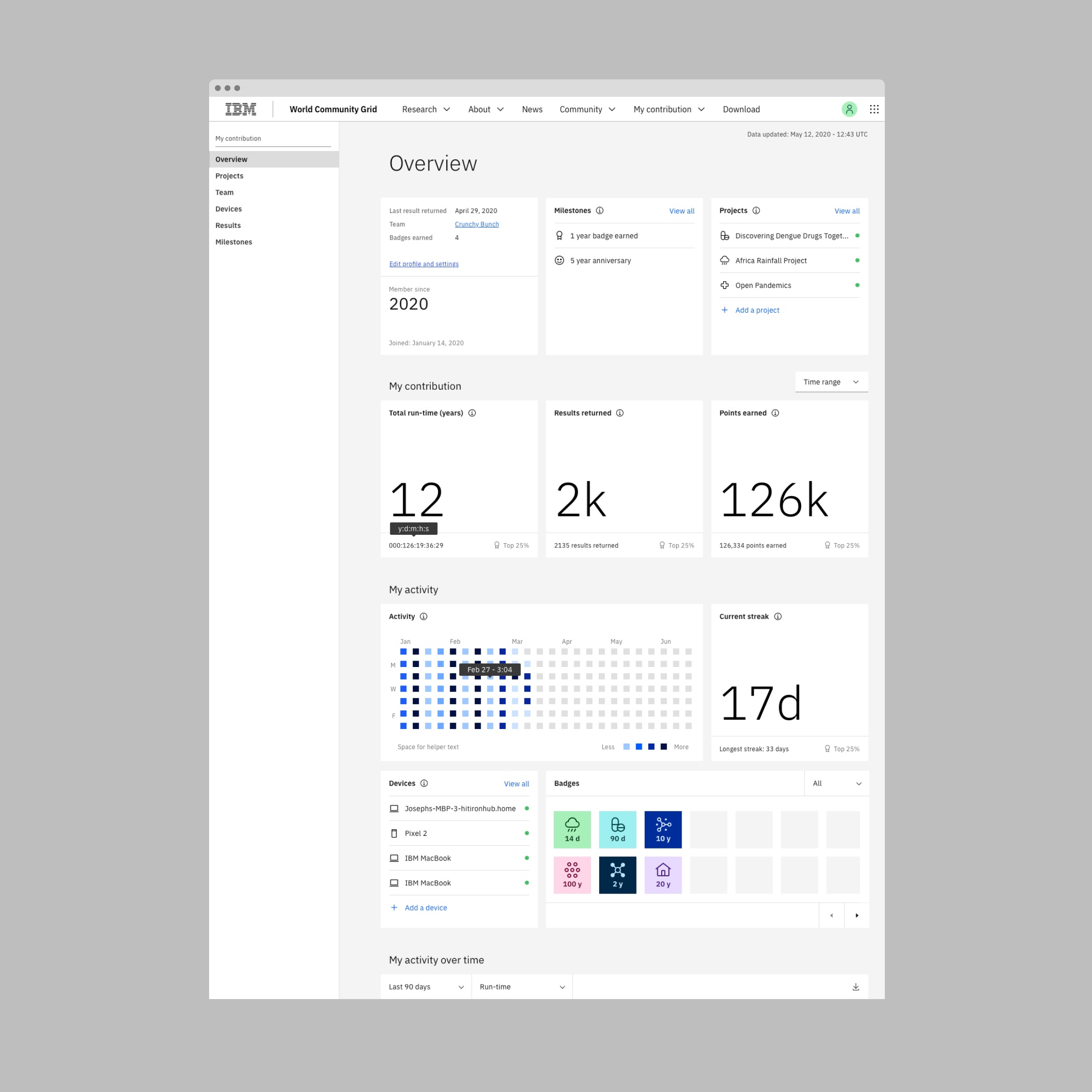
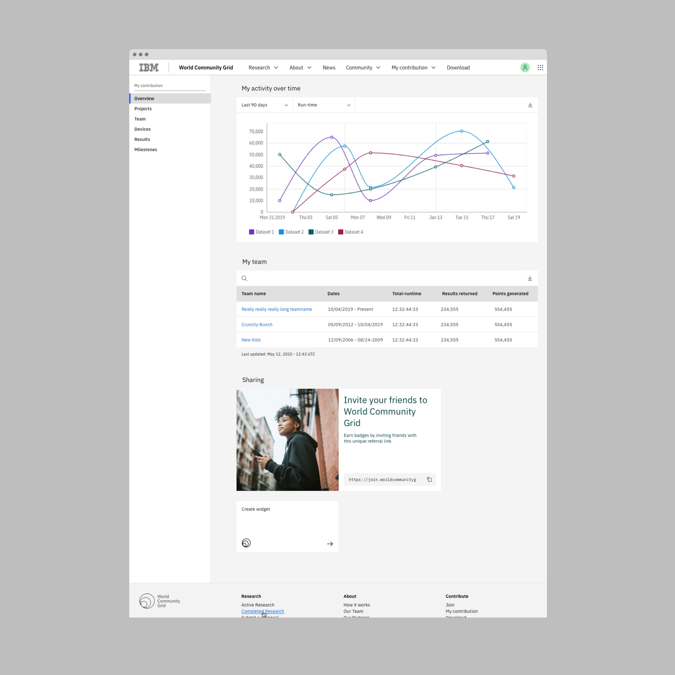
Reimagining the digital experience
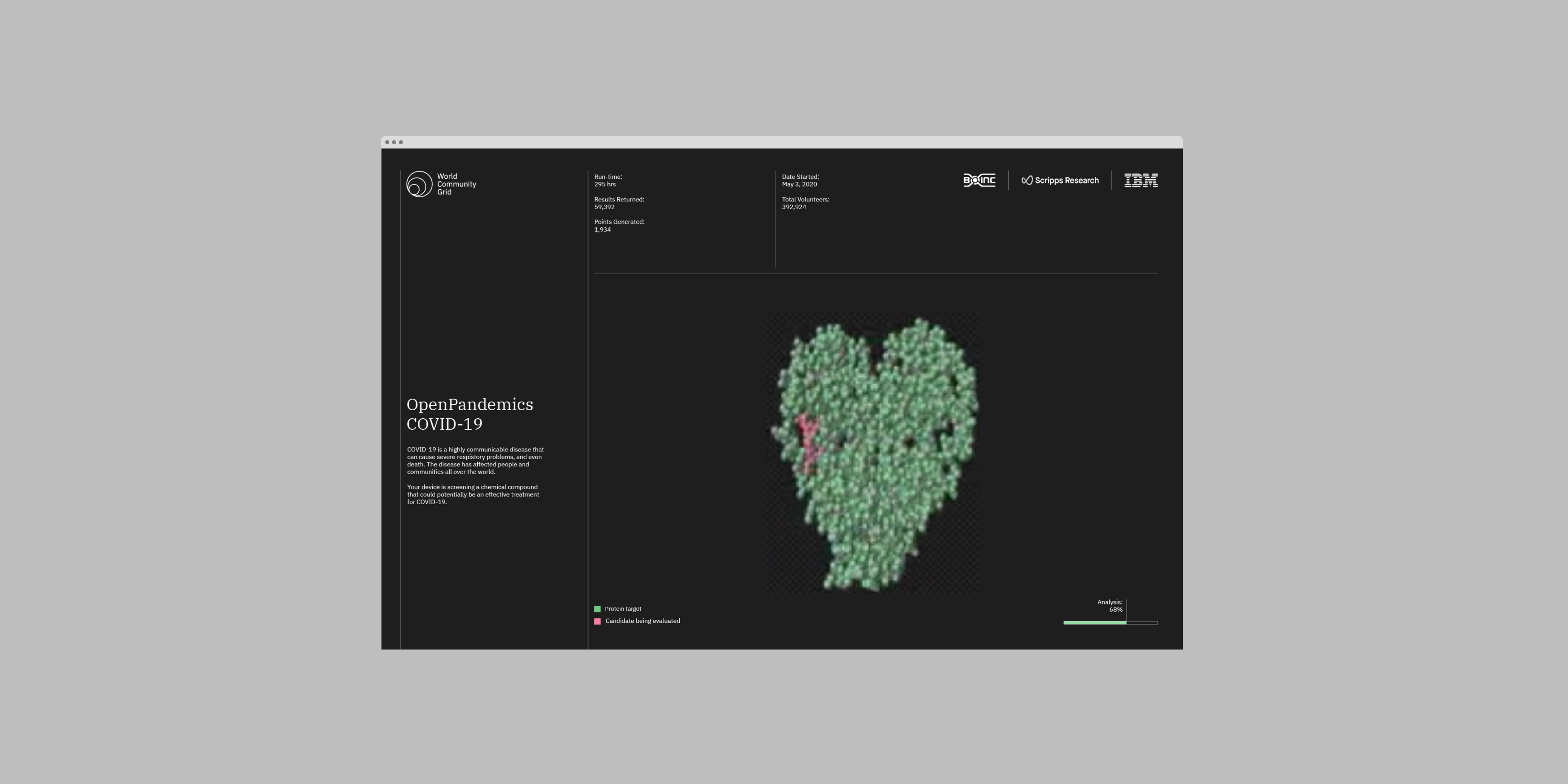
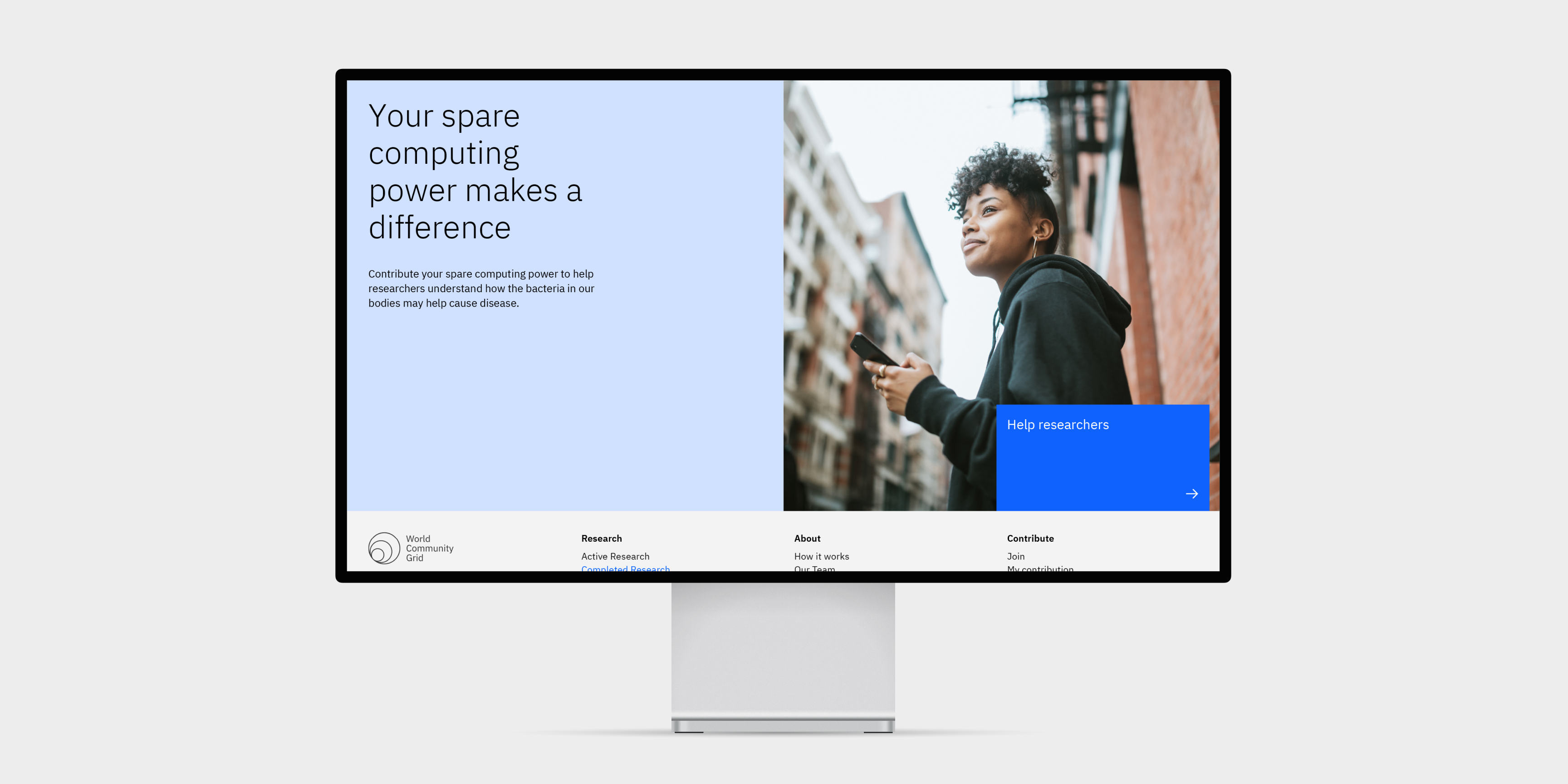
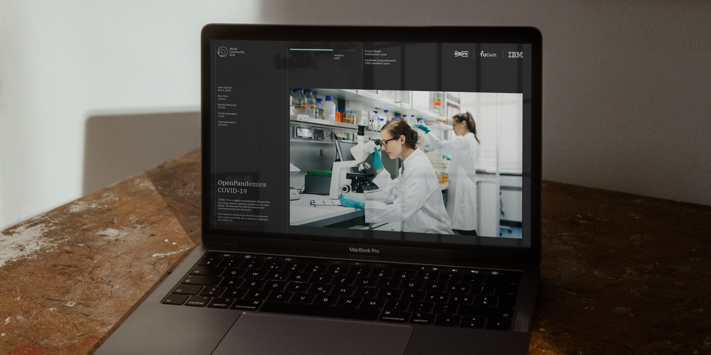
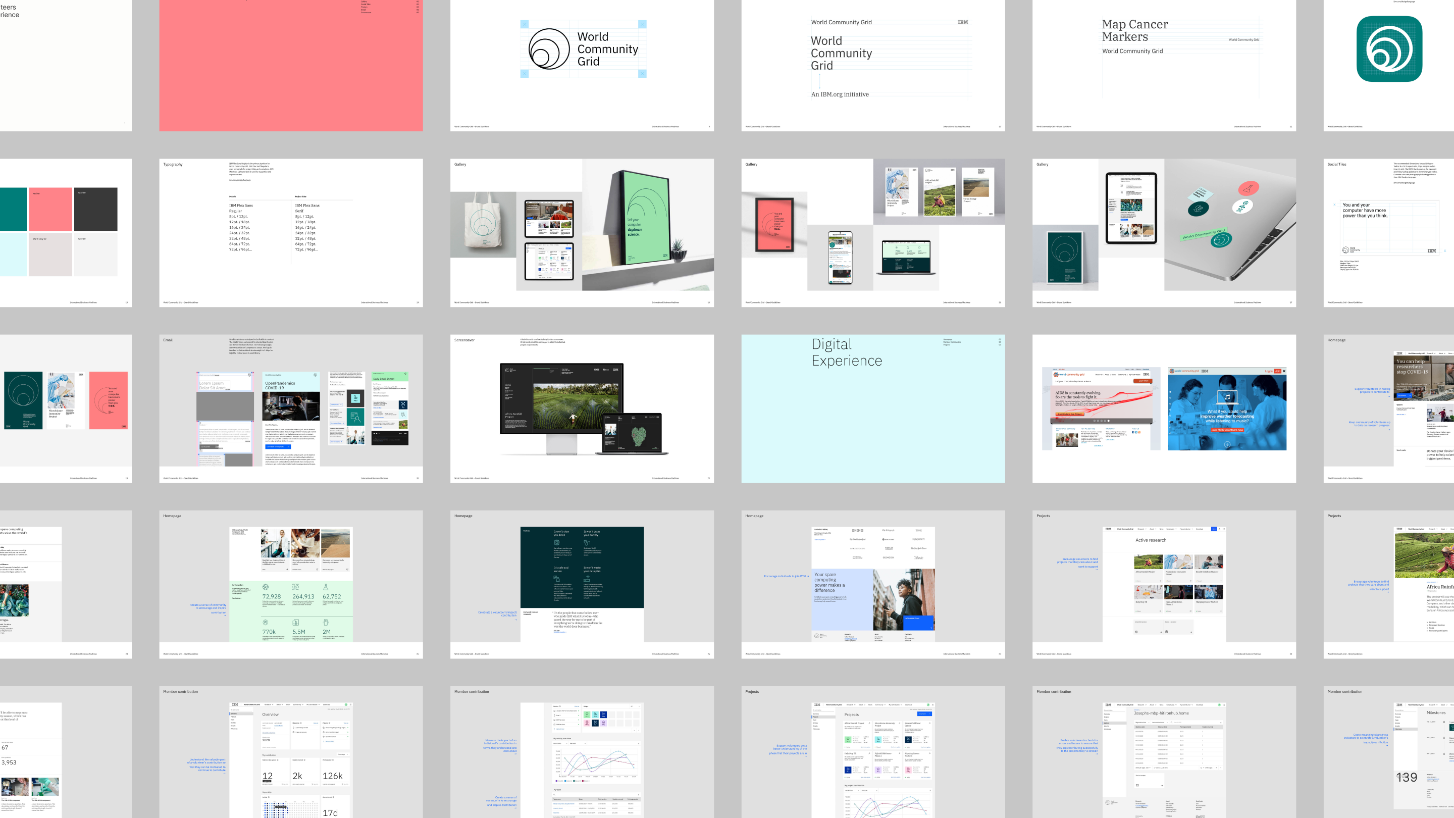
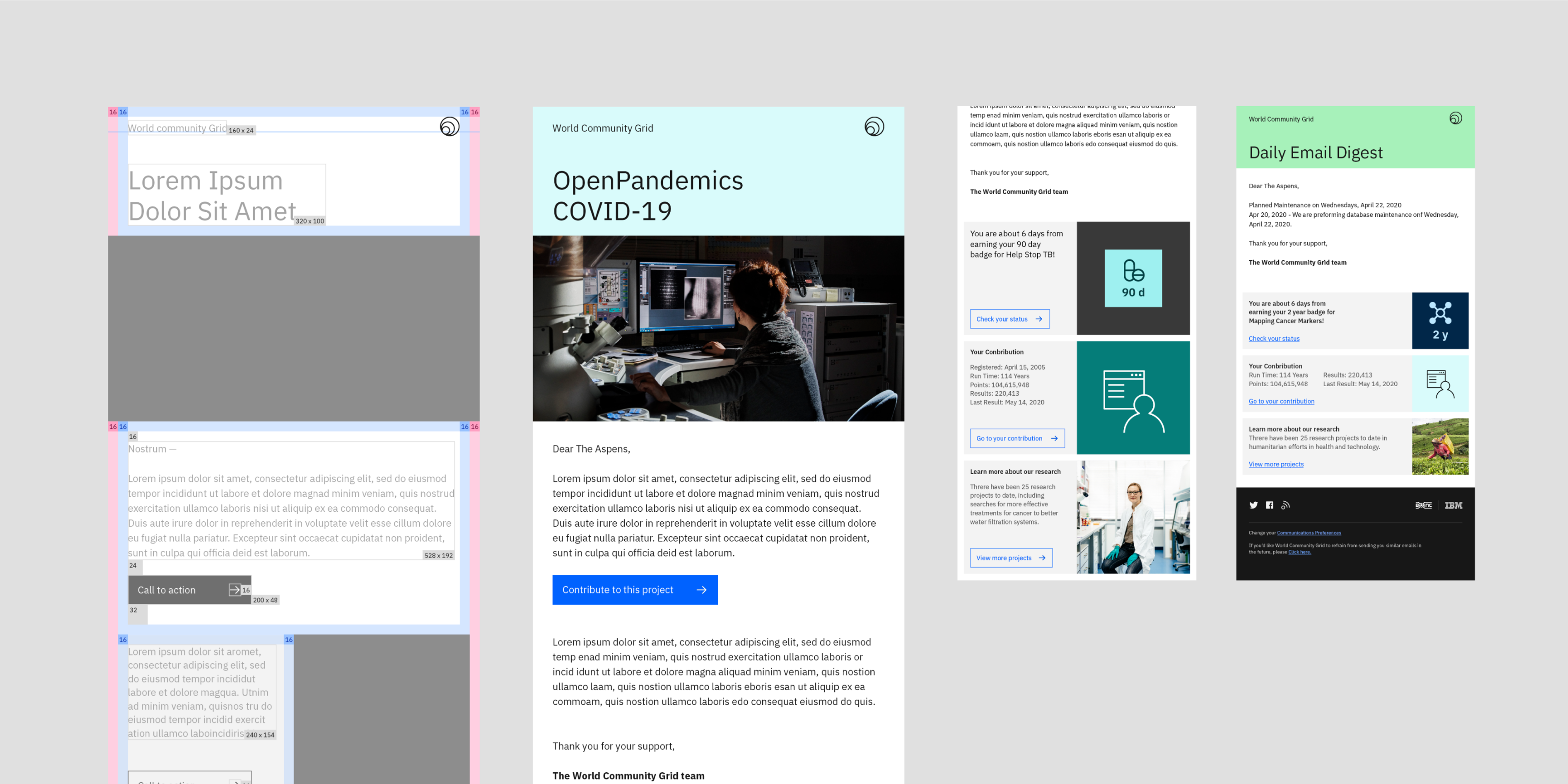
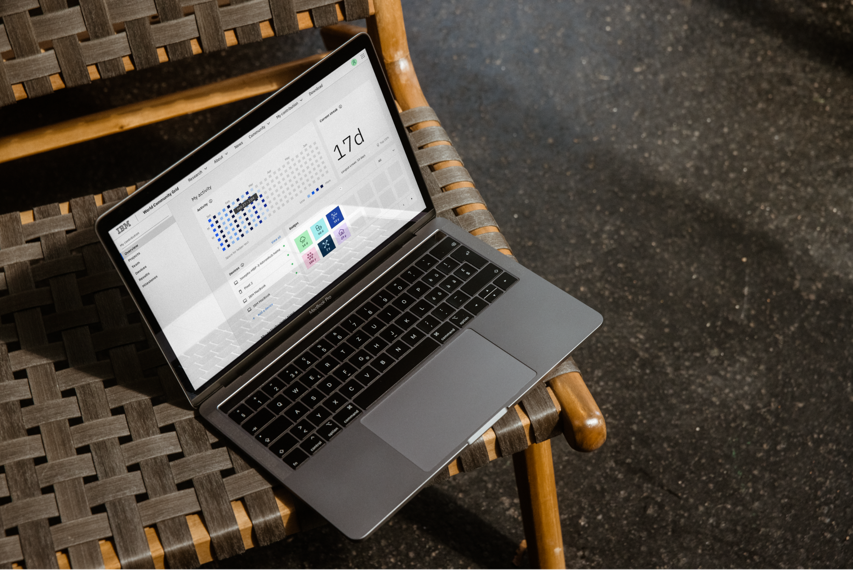
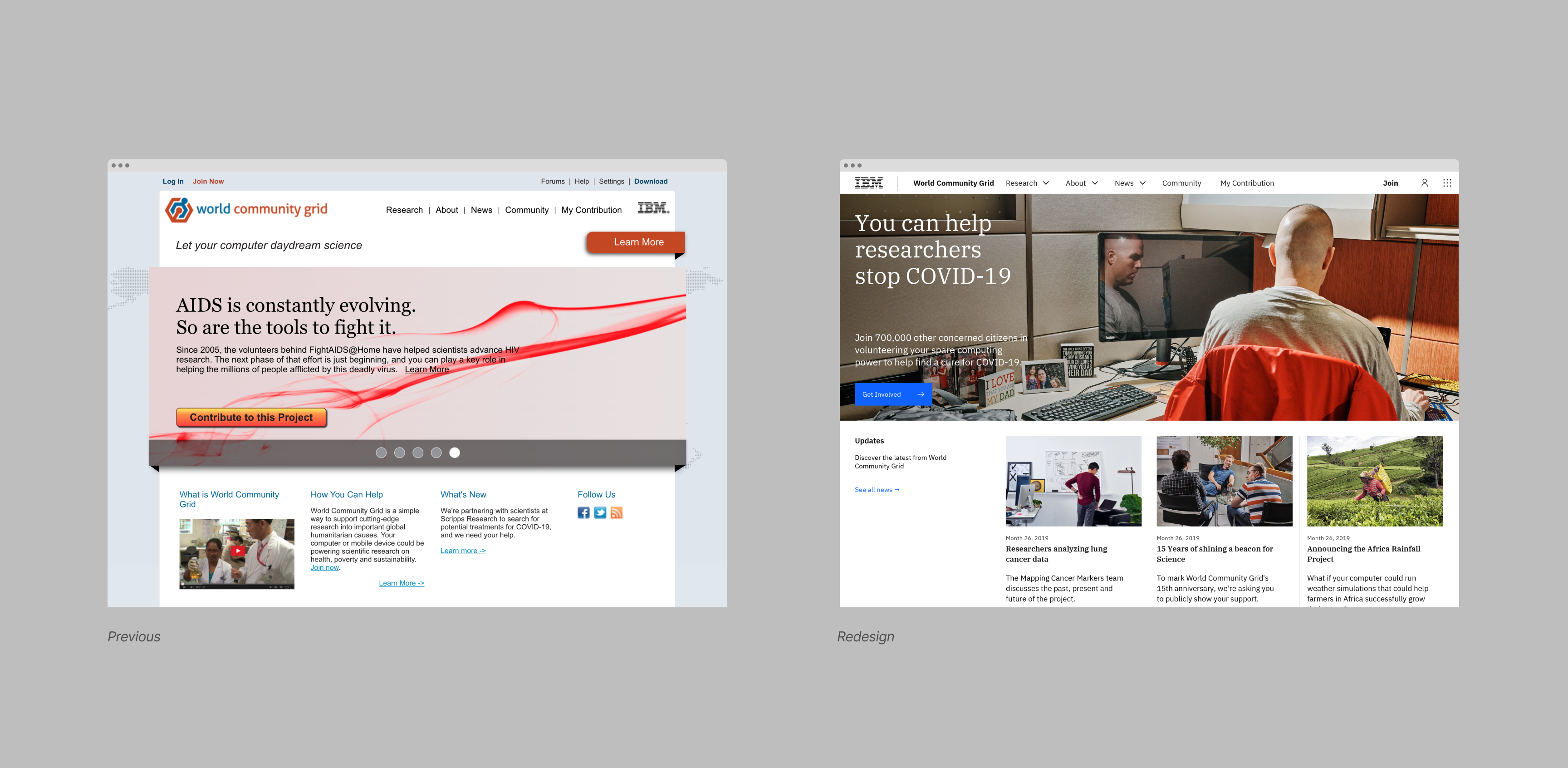
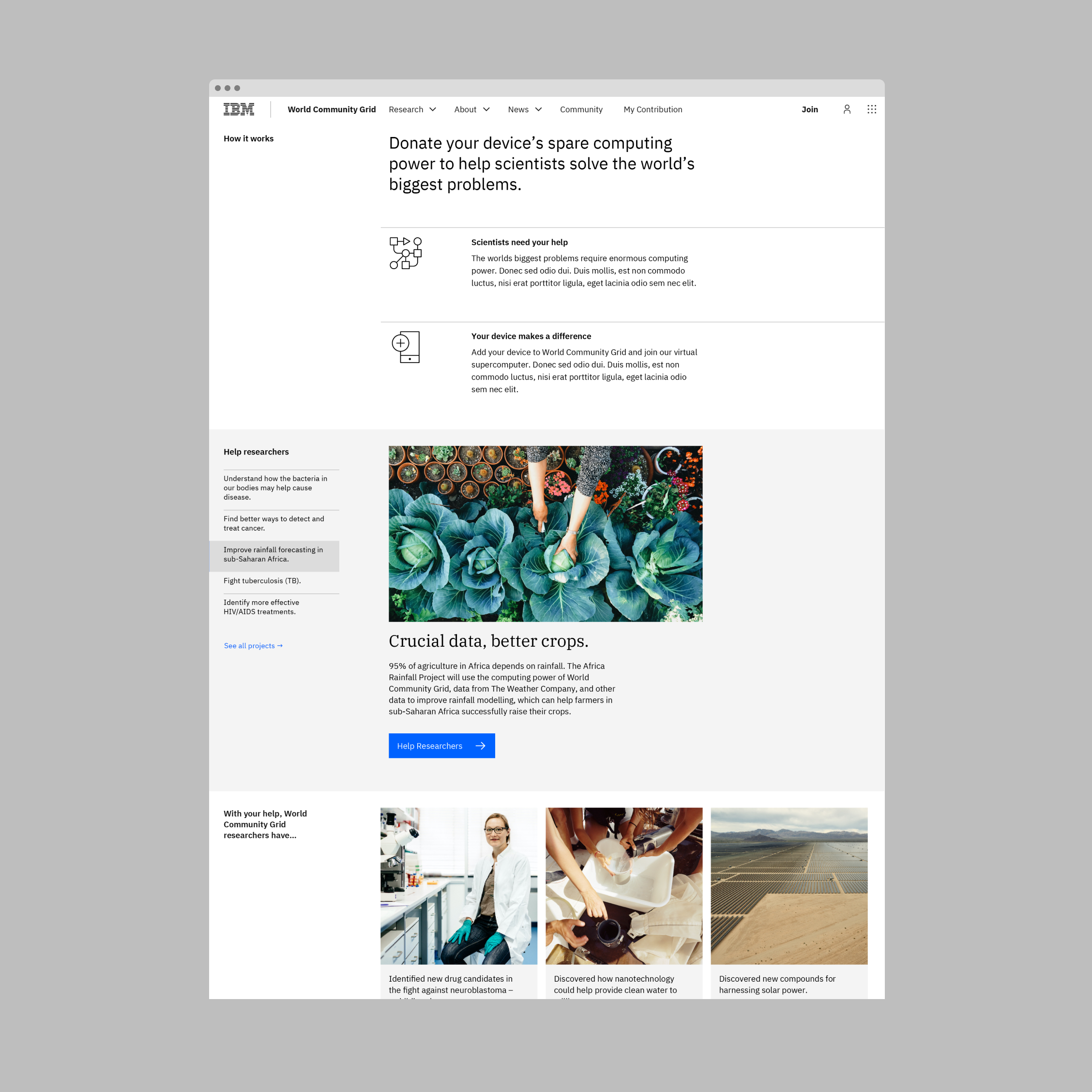
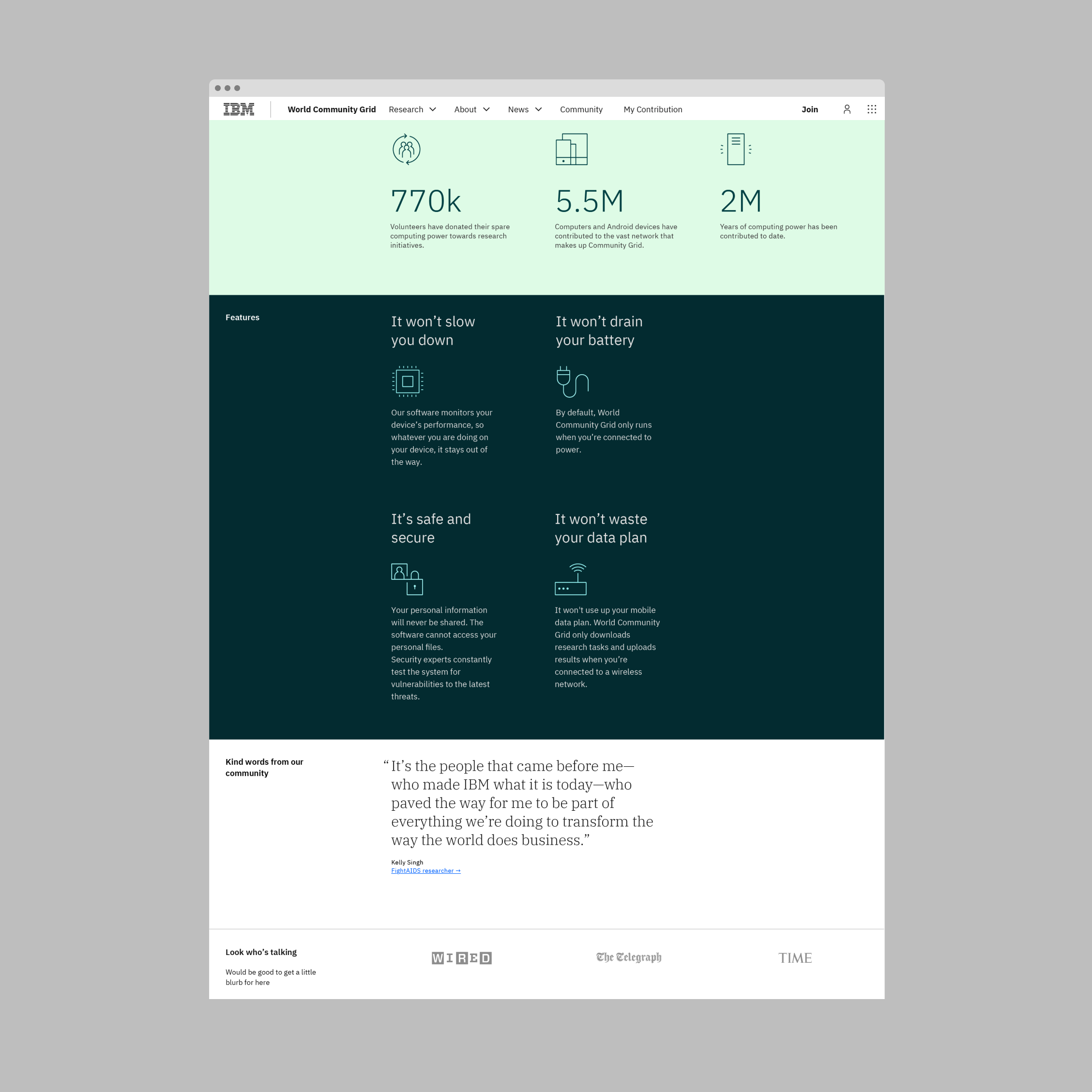
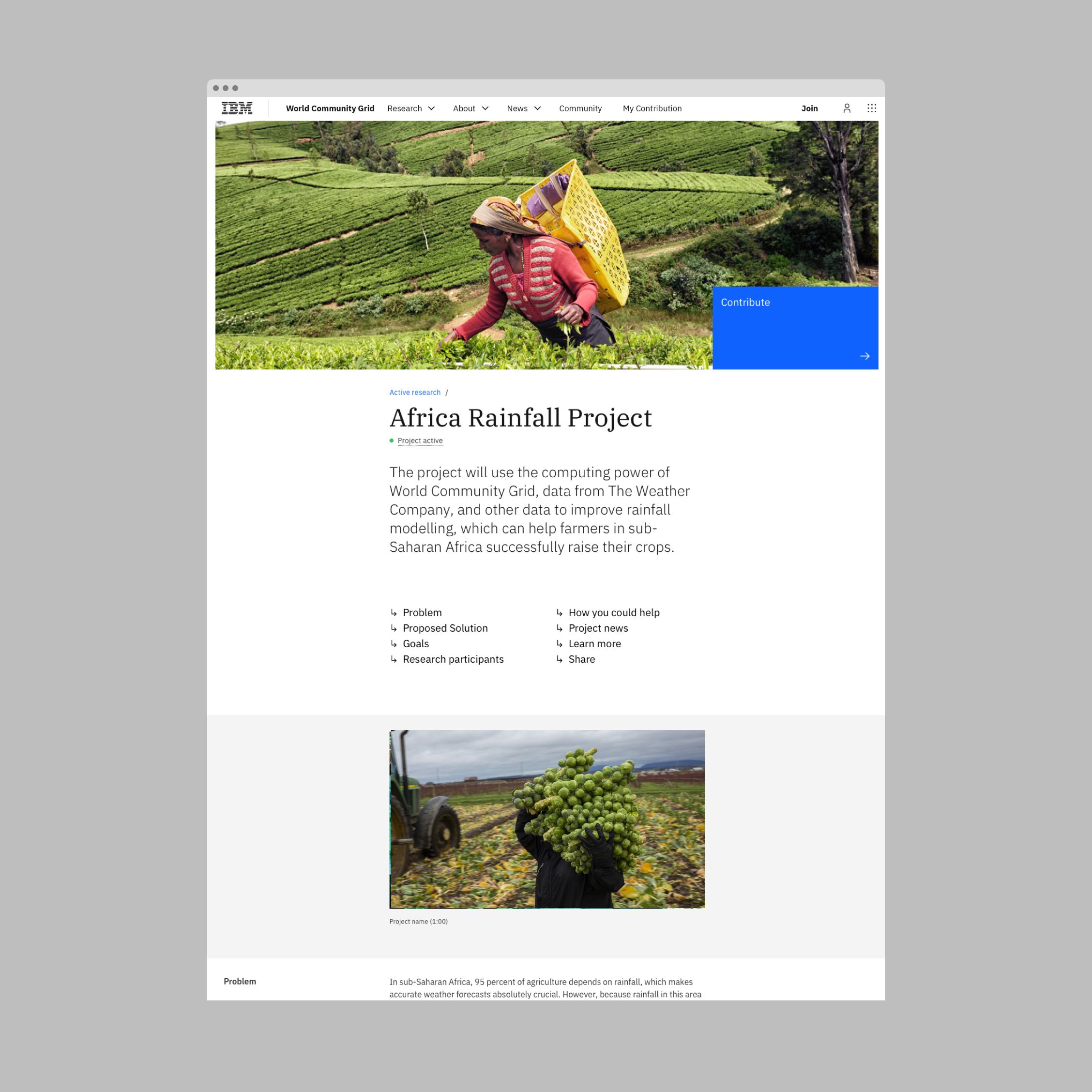
Alongside a new look and feel, the digital experience was redesigned to invite new contributors to participate and connect existing contributors to the research efforts.\n\nFor a newcomer to the website, the goals were to showcase the research and explain how the volunteer network works. Another goal was to help users feel that their individual contribution to the research is making a difference.
Outcome
Changing something so well established is no easy feat. It was about having a clear intention to understand and listen to the voices who know best — the volunteers themselves. Without them, this global network would cease to exist. With this visual refresh, World Community Grid's digital presence was elevated to feel more modern and friendly.
